



Welcome to The Bias Codex, a series about the ways our brains perceive, interpret, and sometimes misread the world around us. Each article explores a few cognitive biases through games, looking at how they shape the player experience and how understanding them can help us design better ones.
This time, we’ll explore the framing effect and confirmation bias, looking at how we present information and what happens once players face it. Let’s dive in!
1. Framing Effect
The framing effect, famously demonstrated by Daniel Kahneman and Amos Tversky, happens when different presentations of equivalent information lead to different judgments or decisions. The facts stay the same, but our response can change.

Let’s take Clash of Clans, a game I know pretty well, as an example. A Clan War attack can earn up to three stars. Imagine earning two stars and seeing one of these messages:
“You earned two out of three stars.”
“You missed one out of three stars.”
These are hypothetical messages. The first highlights an achievement, while the second highlights the distance from a perfect result. Same attack, different story.
Researchers call this attribute framing, where describing the same characteristic positively or negatively can influence how we evaluate it.
Neither version is automatically better. Perhaps the player needed three stars to win a war. Perhaps getting two against that particular base was already an achievement. Their goals, experience and the context around that attack matter when it comes to interpreting that result.

Super Mario Odyssey’s Assist Mode offers extra health and guiding arrows. Now imagine keeping those features exactly as they are, but calling it Ultra Easy Mode.
One label highlights support. The other highlights difficulty. Would players understand the option differently, or feel more comfortable choosing it?
We’d need to test that, of course. But I’d rather explain the help available than make choosing it feel like a judgment about someone’s gaming skills.
Interestingly, a study of financial decisions challenges the idea that framing is simply emotion beating logic. In that task, brain scans suggested that being swayed by the wording was more closely linked to giving the decision less thought than to reacting emotionally. That doesn’t mean emotions never matter, just that “people are being too emotional” isn’t the whole explanation.
And this goes beyond just text. Would highlighting the earned stars rather than the empty one change how players interpret the result? Would the icons and colors we choose for the assist mode make players feel supported or judged? Those are questions worth testing.
The goal is clear and honest communication, not necessarily making everything sound positive. And remember, a nicer presentation does not fix a bad design.
A few questions worth asking:
Are you explaining the option or passing judgment on the player?
Are you testing what players understand, or just counting clicks?
2. Confirmation Bias
Confirmation bias is the tendency to favor evidence that supports what we already believe, while giving contradictory information a harder time. The tricky part is that we can do this while thinking we’re being perfectly fair.
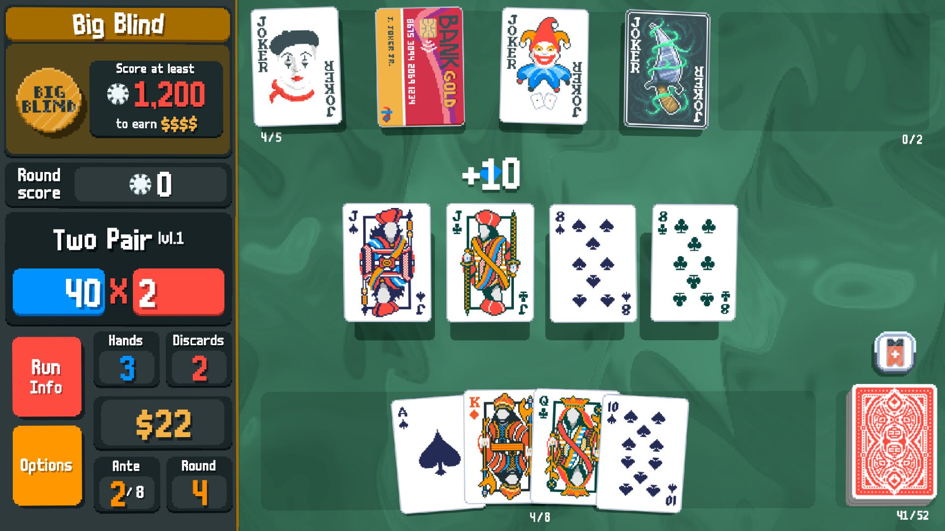
Imagine playing Balatro and deciding that flush builds are clearly the best.
You look for guides that agree. A successful flush run proves you’re right. A strong pair build was just lucky. And when your flush build fails? Well, the shop was terrible.
The strategy keeps every victory and explains away every failure. That is a pretty comfortable arrangement.
In a study using moving dots, people judged which direction the dots were moving, then got another look. Brain recordings suggested that the more confident they were in their first answer, the more they favored evidence that supported it. More weight for “I was right” and less for “maybe I wasn’t.”
More information doesn’t necessarily mean a fresh look.
For me, the practical design takeaway is to always help players understand their results. In Balatro, showing how different cards contributed to the score gives players something to check their assumptions against, rather than leaving them with a final number and a strong opinion.
And we’re not off the hook either. Imagine watching someone try a feature you designed. When they succeed, our interface is intuitive. When they struggle, they weren’t paying attention. Sounds familiar, right?
A few questions worth asking:
Can players understand why something happened, or only see the outcome?
Before testing, have you decided what evidence would make you rethink the design?
🧩 Final Notes
For me, both topics remind us to stay open to feedback and care about what players understand, not just what we intended.
That means questioning how we present choices, making feedback useful, and accepting when our favorite solution isn’t doing the job. And knowing the name of a bias doesn’t make us right. Sometimes the player misunderstood. Sometimes they understood perfectly and simply didn’t like what we made.
Both are worth listening to and learning from.
Well, that’s all for today. See you in the next round with more biases! 😉
Wanna Learn More?
Here are some fantastic resources for you:
Cognitive Bias Index — A useful interactive reference to explore different cognitive biases, what they mean, and how they can affect us.
Thinking, Fast and Slow by Daniel Kahneman — A great foundation for understanding why biases matter beyond games.
Cognitive Psychology Applied to User Experience in Video Games by Celia Hodent — A great starting point for connecting psychology and UX in games.
DarkPattern.games — A useful reference for spotting when design patterns start crossing the line from motivation into manipulation.