

Zelda Echoes of Wisdom // TFTC #3
Creative freedom, a bit of friction, and magical puzzles ✨

Welcome to Tales From The Couch, the series where I share my opinions and short UX notes about a game I played.
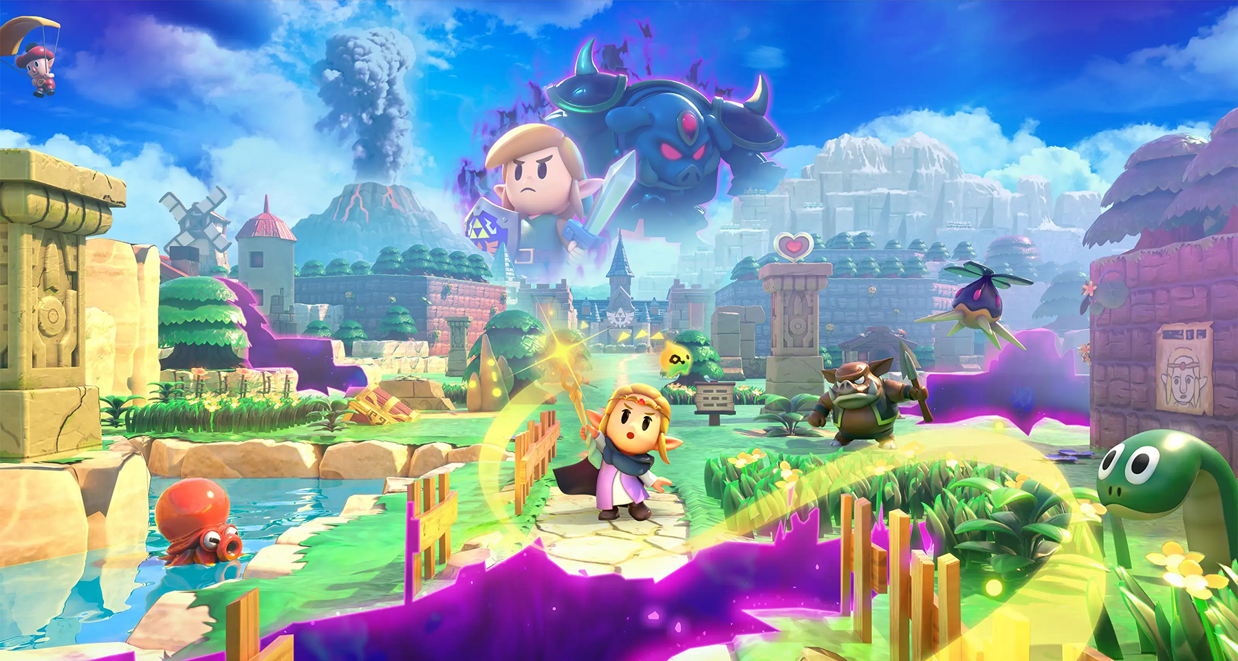
Today we’ll talk about Zelda: Echoes of Wisdom, a bold and clever spin on the franchise that does a lot right.
👾 So, is it good?
Yes, absolutely. This is a vibrant, puzzle-driven adventure that reimagines Zelda as the hero and gives you a toolset that feels fresh and empowering. Instead of swords and boomerangs, you solve problems using "echoes", magical replicas of objects and creatures you've encountered during your journey.
The result is a charming and expressive sandbox. The puzzles are clever, the soundtrack is lovely, and the joy of finding weird solutions never really wears off. It keeps the Zelda DNA intact with all the dungeons and secrets while leaning into experimentation in a way that feels both playful and modern.
It also reminds us how our critical sense changes depending on the quality of the product. When a game is mediocre, we let a lot slide. But when it’s great, we expect every part of it to meet that same high standard and all the small cracks stand out.
🔎 How about the UX?
Echoes of Wisdom is a great reminder that even brilliant ideas need the right UX to fully shine. So, let’s break down the good, the bad, and the ugly of this experience.

1. The Good: A Sandbox Made of Echoes
At the heart of this game is a very UX-friendly mechanic that we started seeing in Zelda: Tears of the Kingdom, creative freedom for overcoming challenges. You can solve puzzles in different ways depending on what you spawn and how you use it.
Got a gap to cross? Build a bridge out of tables. Stack beds. Use trampolines to bounce like an acrobatic goblin. Find the option that fits your playstyle best. It’s fun, systemic, and feels like the game is letting you cheat, but in a way it wants you to.
From a UX perspective, this is a textbook case of “multiple paths to the same goal”, one of the best patterns for accessibility and player engagement. It encourages lateral thinking, experimentation, and personal expression. When a game lets you play your way, that’s powerful.
The balancing here is also solid. Some echoes are definitely overpowered, a couple can make combat less challenging, but you usually get them right as you’re ready to level up your strategies, so they feel empowering, not game-breaking.
2. The Bad: Switch Showing Its Age
The Nintendo Switch has had a good run, but it’s showing its limits. Performance issues like frame drops and stuttering are noticeable in handheld mode, especially during chaotic scenes. It’s not unplayable, but it’s disappointing for a first-party.
From a UX angle, this becomes a problem of delivery. The ideas are strong, but the hardware introduces friction. It’s like trying to paint with only a few crayons. You can still make something great, but it takes more effort than it should. Still not such a big deal, especially with the Switch 2 out in the wild!

3. The Ugly: Menu Madness and Control Issues
Here’s where the experience really stumbles: the UI.
Managing your echoes, arguably the core mechanic, is handled with a clunky, horizontal scroll of tiny icons. There’s no grouping, no customizable categorization, no favorites and no way to remap things. It quickly turns into a patience test. Want to use your go-to echo during a boss fight? Hope you remember where it is — or that it happens to show up in the last-used section.
You can always access the full inventory from the main menu, but who has time for that when you are trying to beat a boss! My immersion and enjoyment was constantly interrupted by waves of annoyance.
From a UX standpoint, this isn’t just a missed opportunity. It actively fights the core gameplay. Simple design tweaks could fix this: group echoes by type or use case. Better use of vertical space. Let players pin favorites. Even adding a second row of icons would reduce the friction significantly. And when your game is about solving puzzles, your tools shouldn’t feel like puzzles too.
There are already many redesigns made by fans circulating online, this video from Game Maker’s Toolkit is a good example, showcasing how a few simple layout changes can massively improve the interaction (spoiler alert: most fan mockups feel better than the official design).
🧩 Final Notes
I had a great time with this game and strongly recommend it. I did all the side quests, explored every corner, and loved messing around with echoes. It’s smart, joyful, and packed with “wait… that actually worked?!” moments.
But it’s also a reminder: great ideas need great UX to really shine. Then again, maybe that’s just the game whispering: "You've got the tools. Fix it yourself."
🎮 What am I playing now?
I've been quite busy but I’m hoping to dive into both Clair Obscur: Expedition 33 and Doom: The Dark Ages as soon as I find time.
And of course, I'd love to hear your thoughts—did you enjoy Zelda: Echoes of Wisdom and agree with what I said? Tell me in the comments, I’d love to hear what you think ⚡
I sold my Switch before finishing the game which is a wild thing to even say out loud considering how much of a Zelda fan I am. The reason why was i'll play it on the Switch 2 at some point in the future when the frame drops are fixed. But what I played I loved and agree the UI switching from echoes when you have unlocked so many was a downer. Great post!